Non-Coding Responsive Web Design: Adobe Muse
About Adobe Muse and Responsive Design
What is Responsive Web?
A definition by w3shools.com: Responsive Web Design makes your web page look good on all devices (desktops, tablets, and phones). In simple words, a website which can adapt itself to all the screen sizes, all devices, and all browsers.

What is Adobe Muse?
Adobe Muse is a standalone desktop application which creates gorgeous HTML5 websites without writing code and comes under the subscription in Creative Cloud.
Why it is so important?
Responsive web design is very important because today everyone uses mobile phones. So almost all clients want a mobile-first website. They want their website which can be viewed very nicely on a mobile phone. That is the reason why responsive web design is so important. All most all web development companies today work on bootstrap.

Principles of Responsive Web :
Responsive web design is a great solution to our multi-screen problem, but no fixed page size, no millimeters or inches, no physical constraints is a difficult part in designing a site. In responsive web design, pixels and percentage are important parameters to be followed while designing.
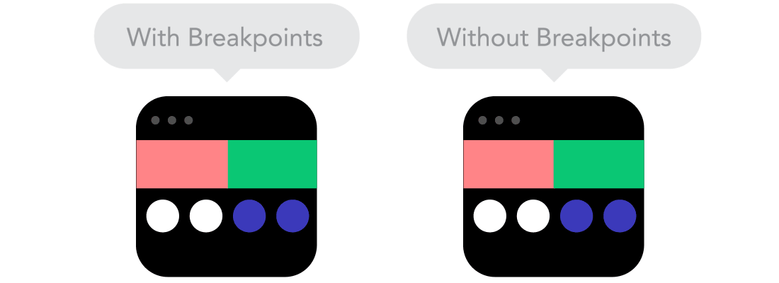
Fixed Width vs Fluid Width: Before responsive design, we designed three separate sites for desktop, mobile and tablet. It contains three CSS files to execute the style of the HTML page. In a fluid layout, breakpoints are introduced, which allows us to change the layout of the website on predefined pixels points. Responsive layouts should adapt to any possible screen size. Best guidelines for setting breakpoints is from Google materials design guidelines.
Relative vs Absolute Units: The canvas maybe the website is differed come a desktop to mobile or anything in between. Pixel density can also vary, so we need units that are flexible and work everywhere. That’s where relative units like percentages come in handy.

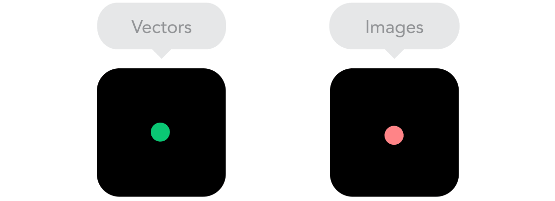
Bitmap images vs Vectors: Does your image have a lot of details? If yes, use a bitmap. If not, consider using a vector image. For bitmaps use a jpg, png or gif, for vectors the best choice would be an SVG. Each has some benefits and some drawbacks. However, keep in mind the size — no pictures should go online without optimization. Vectors on the other hand often are tiny, but some older browsers won’t support it. For example, IE 8.O and before Android 2.3 will not support vector files.
Webfonts vs System fonts: Wanna have a cool looking Futura or Didot on your website? Use web fonts! Although they will look stunning, remember that each will be downloaded and the more you’ll have, the longer it will take to load the page. System fonts, on the other hand, are lightning fast, except when the user doesn’t have it locally, it will fall back to a default font.
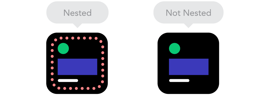
Group Objects: If your websites have a lot of elements but not a group, which will arrange randomly the site and resize automatically(in muse). So group the objects according to the relationship between the elements in your site.
Why Adobe Muse?
Responsive design, as it is today, can be limiting with respect to creativity and unique, thoughtful designs. Designers around the world are discontent with similar layouts and grids that make responsive sites look repetitive and ordinary. With responsive layout in Adobe Muse, you can bring back the soul and magic into your responsive sites.
- No-Coding: Create stunning responsive sites which truly stands out from the designs which are made in coding. In Muse, you design your site and preview it without any line of code or a professional web designer.
- Mobile-friendly sites: Now the smartphone market is hitting very fast by every day, you have to create a different layout for many screen sizes. If you use Adobe Muse, that layout can fit into any mobile devices having any screen sizes.
- Create-design-preview at once: Muse gives you the flexibility to create, layout, and preview web pages on the same canvas. You can preview your design using the scrubber for any browser width. If your design breaks at any point, you can immediately tweak your layout on the same canvas.
- In-Browser Editing: If you want to make changes to your responsive layouts, you don’t have to open Adobe Muse. You can edit content or images in browsers using Adobe Business Catalyst.
- Alternate layout: If you are still not convinced about migrating your websites to responsive layout completely, you can have alternate layouts for specific web pages in your Adobe Muse project.
- Starter designs: If you do not want to create and design web sites from scratch, and want a jumpstart, choose the responsive starter designs for creating personalized websites.
- Features: Support Google Analytics, Google Tacking, etc. They are lot and lot of widgets available for Muse to customise the website properties. Some of the third-party widget providers are 123muse.com, muse-themes.com, musefree.com, etc.
- Export & Publishing: Muse offers many ways to make your site live, you can directly upload the site to your server via FTP, SFTP or you can export site to your desktop and you can use FTP client such as Cyberduck, FileZilla, etc. Publishing your site to business catalyst is very simple just click “publish” button, to upload the site to your server.
What have I done with Adobe Muse?
Well, I had designed a few sites using muse for Beeble Games and other companies also. One of my sites has been came on top on Behance for a month in the year 2016. The Following list of websites is designed in Adobe Muse by me.
Also, Check my Behance Profile: www.vidhunnan.design
Thank you all!
